


This article shares PayPay’s design journey for the “Nearby Deals” feature, added to PayPay in December 2023, providing insights into the unique experience and design process of a map feature. Our Senior Product Designer, Polly, discusses the anatomy of a digital map, cartography rules, PayPay’s purpose-based design strategy, and design principles. We used Mapbox Studio to create our own map layer and learned new skills along the way. Our hope is to inspire more design projects like this in the future.
Pallavi Verma(Polly)
Design Department, Product Division Product Designer
I’m Polly from New Delhi, India! I came to Japan in 2015 as an exchange student at The University of Tokyo. I returned to India and worked for an entertainment ticketing company, and moved back to Japan in 2020 to join PayPay. I experienced working in the Offline to Online and Merchant Services team, and currently I’m working in the finance team.
Agenda
Introduction
Maps have come a long way, from helping pirates navigate in the old days to assisting people to find their favorite smoothie in the modern world. Nowadays, maps come in many formats and are essential to popular apps like Snapchat, Instagram, Airbnb, Ubereats, and Wolt. They’ve become integral to interaction design, making discovering new content more accessible!
PayPay introduced an upgraded “Nearby” feature to its mobile app in December 2023, and we are dedicated to improving the user experience further. We would like to take this opportunity to share our design process journey with the design community, hoping to inspire more innovative ideas.
Revamping PayPay’s Nearby Feature and Map: A Comprehensive Approach
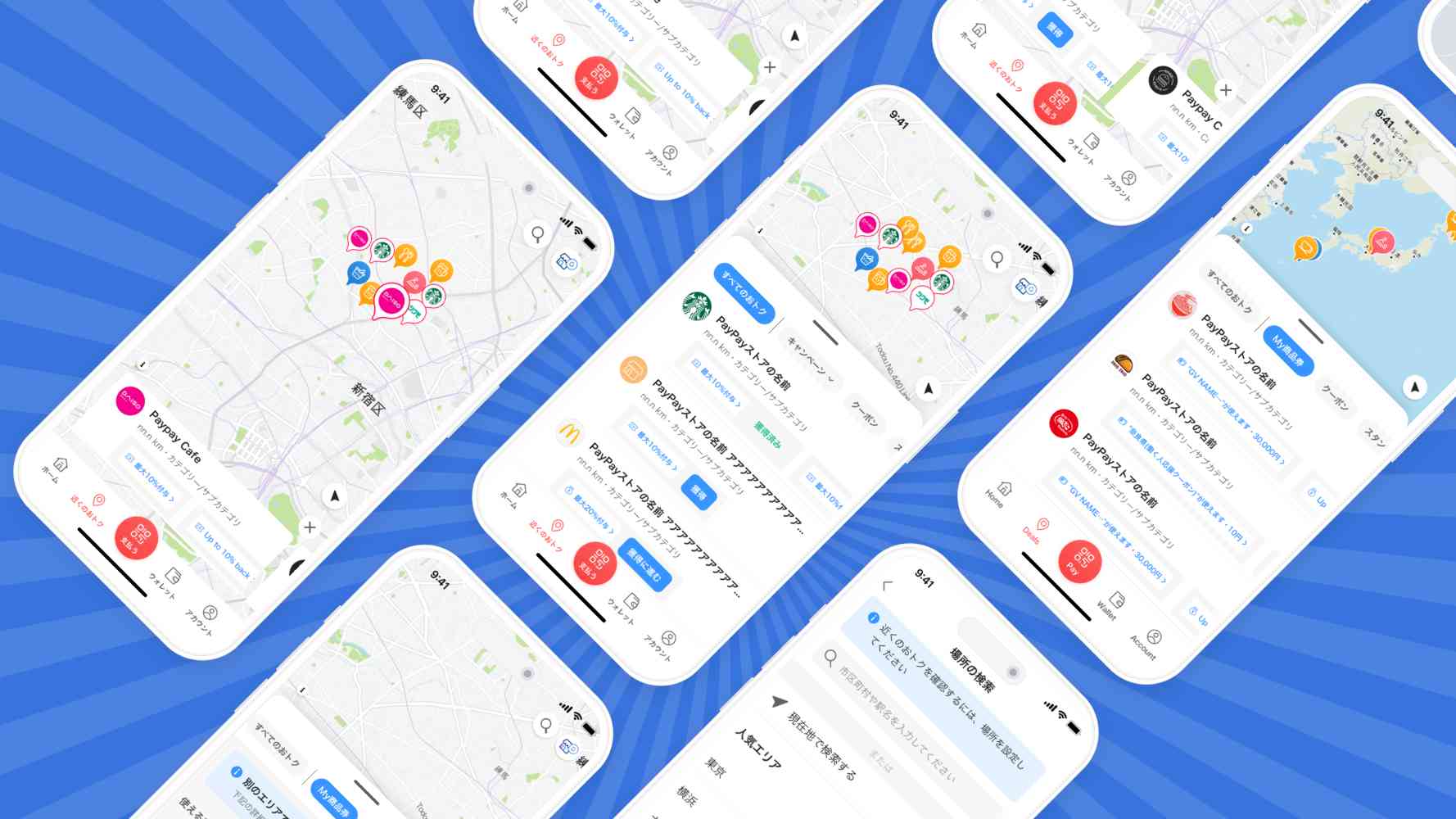
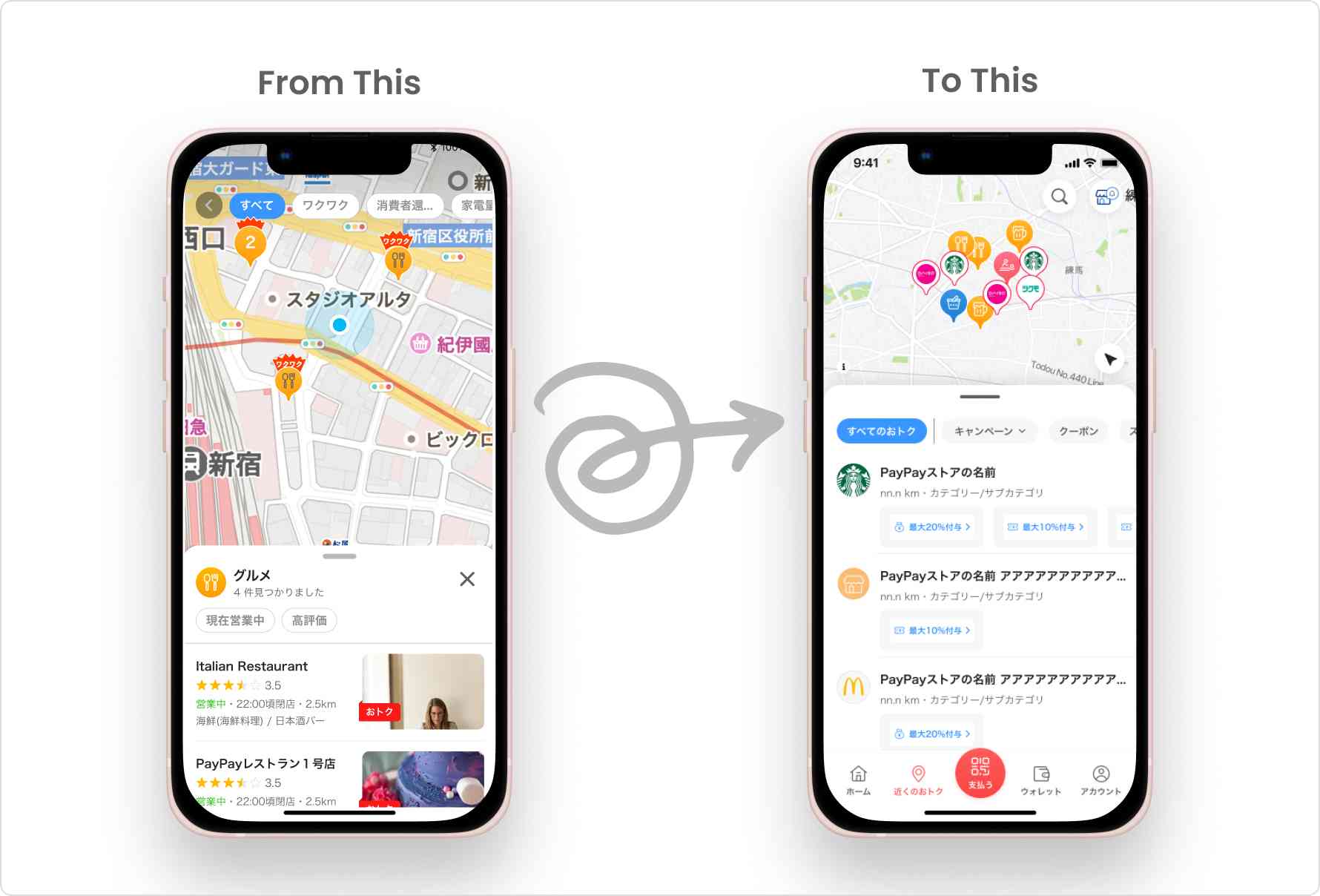
At PayPay, we’re constantly striving to improve our app’s features to provide a seamless experience for our users. One such feature is the Nearby/Chikaku, which shows users nearby stores and ongoing offers/campaigns. We’ve enhanced this feature by displaying more PayPay Coupons and Stamp cards on the Map, making it even more helpful for our users. Our first step was to revamp the Map layer, ensuring it shows essential information without overwhelming the user. Then, we focused on designing the best user experience to find stores with deals, keeping our users’ needs as the priority of our design process.
We decided to create our own map layer using Mapbox Studio instead of relying on an external SDK to render maps in the UI. Although none of us at Paypay are professional cartographers, we took up this challenge and learned new skills along the way. This Map UX Design project was a unique opportunity for us to share our journey since such projects are uncommon. Here’s a quick sneak peek into what we’ve been working on at PayPay.

Step 1: Research to understand the anatomy of a digital map and the rules of Cartography
Layers
A digital map contains layers displaying specific datasets, including a base, data, and interaction layer. Understanding this structure helps streamline the process and achieve precise styling.
Map Tiles
Think of a digital map like a checkerboard, with each tile having a limit to the amount of information it can hold. The number of Points of Interest (POIs) displayed on a digital map depends on the data limit of each tile. This limit determines the amount of information displayed for each POI, including its name, store offers, photos, and other details.
Decluttering of POI
When a user zooms in or out on a map, the tiles on the map cluster and declutter the content it stores. It is important to understand the limitations of this feature, for example, providing too many filtering options on a map can be difficult due to how the tiling system and decluttering work.
Visual Rules of Cartography
Cartographers use various design principles when creating maps, including legibility, visual contrast, organization, hierarchy, and balance. A good map incorporates all of these design principles.
Legends
A good legend should include an easily recognizable Icon and a short description that provides context. A map with an ice cream Icon to indicate a frozen area could be an example of poor design.
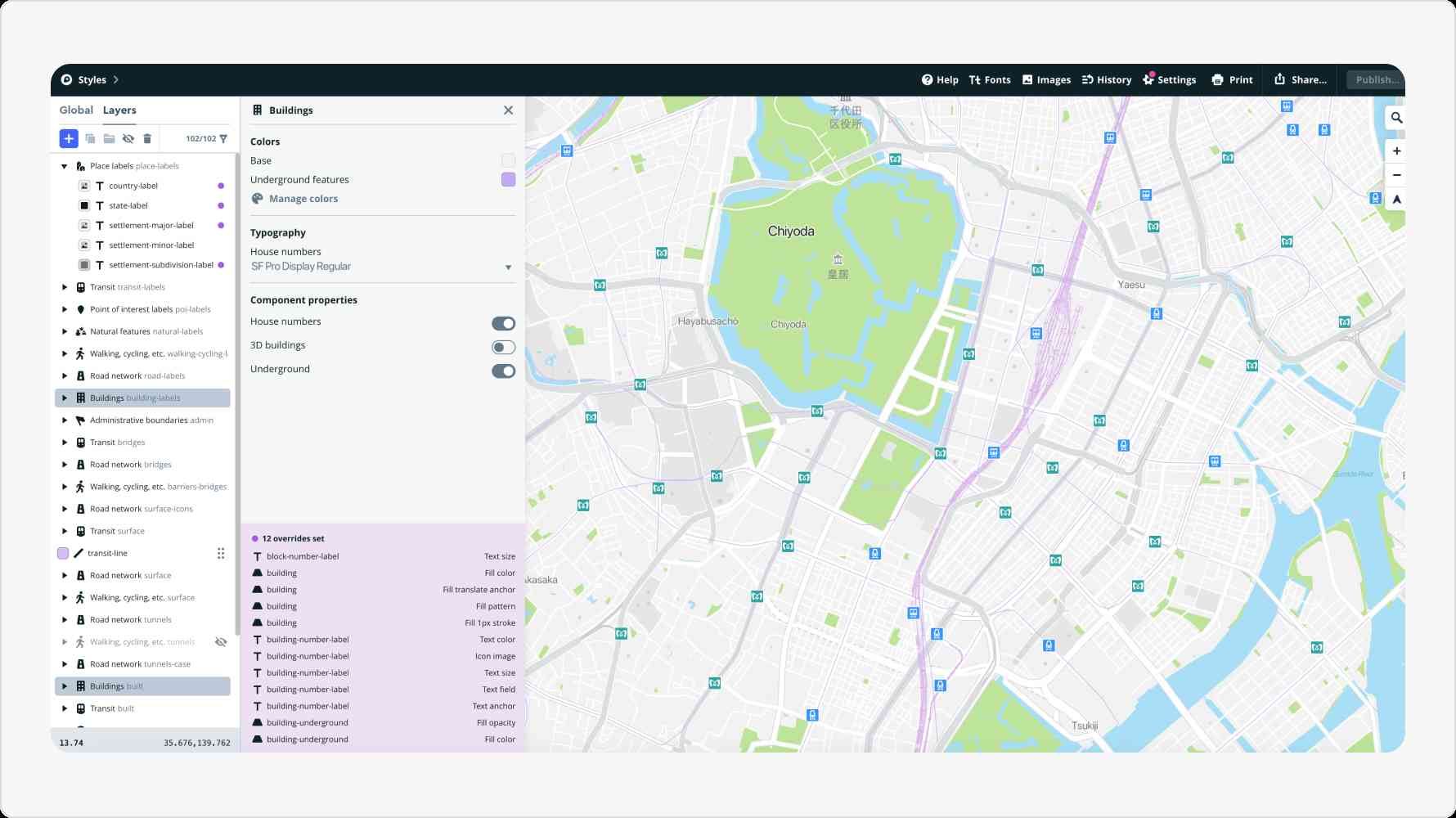
Step 2: Working on Mapbox Studio
Many companies use third-party SDKs to reduce resource, data, technology, and design load. At PayPay, we utilized Mapbox Studio to manage and control customization, which is similar to working with Figma or Sketch.
Step 3: Define a purpose-based design strategy
Every map has a specific purpose, and customizing a map style to the app’s intent can help communicate that purpose and create a user-centered design.
As part of our design process, we were inspired by the latest map UI/UX design trends, which we identified by studying other popular navigation apps.
Our research found that maps primarily used for exploration and discovery purposes tend to have a simple color scheme, with single tones of the same hue.
- For instance, popular apps like Airbnb and Uber use a predominantly monochromatic color palette with low contrast. This ensures that the base map remains subtle and doesn’t distract viewers from the content.
- Terrain base maps, like the ones used by Alltrails, effectively highlight data about the outdoors, nature, and hydrology, providing a confident choice for specific apps.
- Street maps with highlighted transit modes are typically good for navigation apps. Yahoo! JAPAN Map is an excellent example of this.
PayPay users use the app to discover stores and offers and do not expect to navigate. Therefore, our design philosophy was focused on simplifying our design to enable users to stay focused on the hero content and be aware of all relevant information simultaneously.
Step 4: Applying the Design Principles
When adjusting map styles, we carefully considered design principles for colors, typography, symbols, and textures.
- Contrast determines how well the features stand out against the surrounding elements to emphasize the intended parts. We carefully choose the color palette for it.
- Hierarchy and density hold significant importance in our design philosophy. They are the guiding principles that help us structure and present the information on our map. We ensured that relevant information appeared progressively when a user zooms in, providing a smooth and digestible map experience.
- Legibility defines the proximity of the labels and map elements to each other. We used Gestalt theory and an information mapping technique to organize our map in a way that’s easy for users to understand.
Step 5: Designing Store Information
After the map layer redesign, we worked on improving the user experience for finding stores that offer discounts near them. Previously, in the Nearby/Map feature, users could only locate stores that accepted PayPay or had PayPay campaigns by turning on the “offer” filter. However, as PayPay grew, we introduced Coupons and Stampcards on PayPay, which gave users more opportunities to save money. To help users find such stores near them, we decided to redesign the user experience of this feature and provide users with a curated list of stores near them in various categories, focusing more on discounts.
We also provided discount filters to simplify their search. Moreover, we allowed users to claim coupons directly on the map, which proved very helpful for them.
Next Steps
We went through a series of steps and iterations to create a Map that meets user expectations. Our design process involved deciding the UI of roads and buildings and understanding how different layers, zoom levels, and POI decluttering affect the overall UX of the app.
We have recently launched a new feature and are constantly monitoring user feedback to improve it further. Through our efforts, we have noticed an increase in PayPay Deal Discovery, and more users are now aware of PayPay deals, such as coupons, stamp cards, and flyers. Our journey has taught us that designing a Map User Experience requires a deep understanding of user behavior and preferences.
In the End
Thank you for taking the time to read this article. We hope you found the insights into our design process helpful for your own work and career in design. Please stay tuned and follow our Design Blog, Design Talks!
Current job openings
*Job openings and employee affiliations are current as of the time of the interview.